PSAT Math Multiple-Choice Question 245: Answer and Explanation
Question: 245
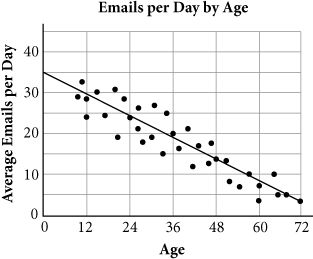
Which of the following equations best represents the trend of the data shown in the figure above?
- A. y = -2.4 x + 30
- B. y = -1.2 x + 40
- C. y = -0.8 x + 40
- D. y = -0.4 x + 36
Correct Answer: D
Explanation:
D
Difficulty: Hard
Category: Problem Solving and Data Analysis/Scatterplots
Getting to the Answer: A line that "represents the trend of the data" is another way of saying line of best fit. The trend of the data is clearly linear because the path of the dots does not turn around or curve, so draw a line of best fit on the graph. Remember, about half of the points should be above the line and half below.
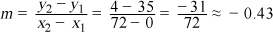
If you draw your line of best fit all the way to the y-axis, you'll save yourself a step by simply looking at the scatterplot to find the y-intercept. For this graph, it's about 35. This means you can eliminate choices (B) and (C). Next, find the approximate slope using two points that lie on (or very close to) the line. You can use the y-intercept, (0, 35), as one of them to save time and estimate the second, such as (72, 4). Use the slope formula to find the slope:
The equation that has the closest slope and y-intercept is (D). (Note that if you choose different points, your line may have a slightly different slope or y-intercept, but the answer choices will be far enough apart that you should be able to determine which is the best fit to the data.)
Test Information
- Use your browser's back button to return to your test results.
- Do more Math Multiple-Choice Tests tests.
More Tests
- PSAT Math Multiple-Choice Test 1
- PSAT Math Multiple-Choice Test 2
- PSAT Math Multiple-Choice Test 3
- PSAT Math Multiple-Choice Test 4
- PSAT Math Multiple-Choice Test 5
- PSAT Math Multiple-Choice Test 6
- PSAT Math Multiple-Choice Test 7
- PSAT Math Multiple-Choice Test 8
- PSAT Math Multiple-Choice Test 9
- PSAT Math Multiple-Choice Test 10
- PSAT Math Multiple-Choice Test 11
- PSAT Math Multiple-Choice Test 12
- PSAT Math Multiple-Choice Test 13
- PSAT Math Multiple-Choice Test 14
- PSAT Math Multiple-Choice Test 15
- PSAT Math Multiple-Choice Test 16
- PSAT Math Multiple-Choice Test 17
- PSAT Math Multiple-Choice Test 18
- PSAT Math Multiple-Choice Test 19
- PSAT Math Multiple-Choice Test 20
- PSAT Math Multiple-Choice Test 21
- PSAT Math Multiple-Choice Test 22
- PSAT Math Multiple-Choice Test 23
- PSAT Math Multiple-Choice Test 24
- PSAT Math Multiple-Choice Test 25